feelgoodhit
Bluelighter
i like this thread! i'm excited to see what creative entries come up. maybe i'll try whipping one up too.


")
Nothing set in stone yet, chrissie. I know it's bad of me/us to kick this off without a base colour scheme platform and I apologise to everyone for this. I'm hoping to use this round as an "idea" round and we could always build on it and who knows, the colour scheme could very well take birth from the logo rather than the other way around. As someone suggested, however, the request is for all participants to please keep/save and make available their psd files. Thanks very much for the interest and I'd love to see some of your ideas.chrissie said:Question - what will the new board skin look like?

yeah i thought the sametribal girl said:I don't like it, it looks too muck like the 'Toys "R" Us' logo.
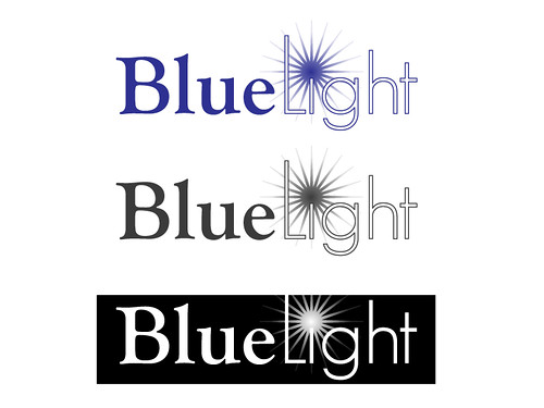
alasdairm said:my tiny gripe is that, if you don't know it says 'bluelight' it's almost impossible to read as 'bluelight'. i think if you could make the 'bluelight' more recognisable or legible, it would be great.

")