felix
Bluelight Crew
that's probably racist. 8)tambourine-man said:Japaneasy style! \(^o^)/


that's probably racist. 8)tambourine-man said:Japaneasy style! \(^o^)/


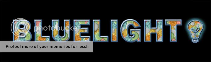
felix said:that's probably still up for debate. but i think the dimensions of the current one would be a good guide, perhaps a bit taller. (256 x 48.)

")
Whoops... I think that was contradictory to the advice I gave about being more experimental. We've got the opportunity to rebuild the forums from the bottom up and I saw (see) no reason to persist with those very, very limiting dimensions.felix said:hey i really like that! (pennywise's one.)
have you guys thought about making these logos a more suitable size? remember they'll be displayed at the top of every single page on the site. like i said on page 1:
i would legibility at a smaller size would be a pretty important factor when deciding on a winner. there are a lot of awesome entries here, but i think most of them are too big in their present form.
d'oh. i never noticed your post on the subject. i usually just skip over them. fair point well put my son! but like i said in my first post, that was merely my own opinion, it won't be up to me. i still think the current one will be very difficult to beat!tambourine-man said:Whoops... I think that was contradictory to the advice I gave about being more experimental. We've got the opportunity to rebuild the forums from the bottom up and I saw (see) no reason to persist with those very, very limiting dimensions.
A lot of forums these days will use a banner space that exceeds 100-120 pixels. Not all, but a lot. It allows a bit of creativity if you want to customise the navbar, gives opportunity to provide ample advertising/banner-sharing space and makes the top of the forums a little less squashed.
Resizing isn't too difficult anyway.
")
Hahah! :DStoneHappyMonday said:I don't like
All the ones with electric light bulbs.


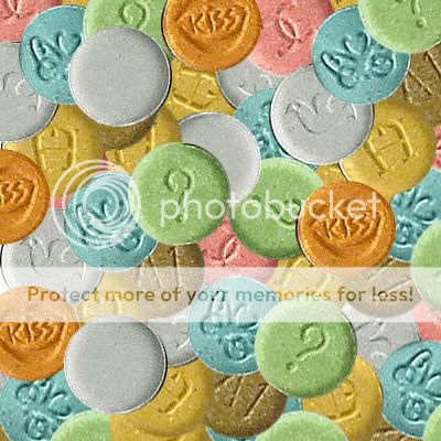
Do you have the layered file? Attach it and I'll have a crack.pennywise said:I thought a transparent lettering design with the pills texture would be cool (where the letters look like the light bulb), but I quit for now. Here's the texture I made if anyone wants to take a shot at it.
SA said:I/We would prefer to see the logo represent the Bluelight mission - harm reduction


spork said:^Maybe a pill like the current logo but with the pill texture inside of the pill?