

You are using an out of date browser. It may not display this or other websites correctly.
You should upgrade or use an alternative browser.
You should upgrade or use an alternative browser.
Request New sub forum banners
- Thread starter Nurse Ratched
- Start date

Nurse Ratched
Bluelight Crew
That's the one i wanted to work on next. You read my mind. My idea was the Government building of 3 different Countries with their respective flags. The White House, The Kremlin and whatever building is in the UK. With their flags flying above them. I know Science is supposed to be included ( as well as current events ) but since it is mostly political the buildings would be good.Imo, CEPS could use a new one. Not sure what exactly, but I'm imagining lots of different flags or something, or maybe like a political compass? I'm not sure really, but I'm not a huge fan of the one we have now.
Or I would love some other people's inputs. Members and mods are all welcome. Give us your opinions and ideas. Or maybe just 10 different flags or something without pictures of the buildings. Was going to get with @Negentropic on it next week and make sure he is feeling better and wants to do another one.
Nurse Ratched
Bluelight Crew
Let me know when you feel up to creating something new for ceps @Negentropic
And I hope you are feeling better. Have a good weekend....if you can. xoxo
And I hope you are feeling better. Have a good weekend....if you can. xoxo
Jabberwocky
Frumious Bandersnatch
probably a few more days, I am still writhing in withdrawalLet me know when you feel up to creating something new for ceps @Negentropic
And I hope you are feeling better. Have a good weekend....if you can. xoxo
damn kratom u nasty bastard
thegreenhand
Bluelight Crew
The newly renamed Drug Policy & Media Coverage could use one
The ancient Roman forum as a center of political debate has always fascinated me. Something incorporating architecture of this style maybe?
Not an immediate need tho. @Negentropic seems you have been spearheading this task. Absolutely no rush.
The ancient Roman forum as a center of political debate has always fascinated me. Something incorporating architecture of this style maybe?
Not an immediate need tho. @Negentropic seems you have been spearheading this task. Absolutely no rush.
darvocet21
Bluelighter
- Joined
- May 31, 2021
- Messages
- 27,094
The newly renamed Drug Policy & Media Coverage could use one
The ancient Roman forum as a center of political debate has always fascinated me. Something incorporating architecture of this style maybe?
Not an immediate need tho. @Negentropic seems you have been spearheading this task. Absolutely no rush.
Even pretty places are somehow diminished by the imgrrr logo
Jabberwocky
Frumious Bandersnatch
I'm over the worst of it now and definitely starting to feel better, but I have had complete insomnia for 7 days. Once I get my sleep back, I can get back to having fun with graphics ")
I've literally slept about 5 hours total in the last 7 days. I have no idea how my body is even functioning. I might crash tonight, I hope, I pray.
I've literally slept about 5 hours total in the last 7 days. I have no idea how my body is even functioning. I might crash tonight, I hope, I pray.
Xorkoth
Bluelight Crew
Even pretty places are somehow diminished by the imgrrr logo
You can link to the raw image from imgur, you don't need to use the version that has the imgur logo and frame.
thegreenhand
Bluelight Crew
whenever i try to use 'insert image' thing on the toolbar and put in the imgur link i get a message saying
"image cannot be loaded from the passed link"
"image cannot be loaded from the passed link"
- Joined
- Mar 7, 2011
- Messages
- 25,703
The newly renamed Drug Policy & Media Coverage could use one
The ancient Roman forum as a center of political debate has always fascinated me. Something incorporating architecture of this style maybe?
Not an immediate need tho. @Negentropic seems you have been spearheading this task. Absolutely no rush.
Ohhhhh, I like the second picture best.
We are going to need three new banners for CEPS here soon.
I have no image editing skill or I would do it myself.
Is anyone else able to do these thing besides negentropic? Would be good to have a squad for stuff like this, he shouldn't have to do all of them.
Nurse Ratched
Bluelight Crew
I wish i was as good at it as snaffy is. I would rock this place out with cool new banners.Ohhhhh, I like the second picture best.
We are going to need three new banners for CEPS here soon.
I have no image editing skill or I would do it myself.
Is anyone else able to do these thing besides negentropic? Would be good to have a squad for stuff like this, he shouldn't have to do all of them.
C'mon you artistic BL'ers.........throw your hat in the ring and create us some banners.
You will then be allowed access to the Admin's midget porn.
- Joined
- Mar 7, 2011
- Messages
- 25,703
Whoa, whoa, whoa now.... Hold up we can't be making these kinds of lopsided dealsI wish i was as good at it as snaffy is. I would rock this place out with cool new banners.
C'mon you artistic BL'ers.........throw your hat in the ring and create us some banners.
You will then be allowed access to the Admin's midget porn.
Nurse Ratched
Bluelight Crew
Oops. If my satire was out of line I will delete the post. Me no likey that wow emoji. Makes me think I oopsed.Whoa, whoa, whoa now.... Hold up we can't be making these kinds of lopsided deals
- Joined
- Mar 7, 2011
- Messages
- 25,703
Haha no you're good I was just goofingOops. If my satire was out of line I will delete the post. Me no likey that wow emoji. Makes me think I oopsed.
Nurse Ratched
Bluelight Crew
whewHaha no you're good I was just goofing
mal3volent
Bluelight Crew
- Joined
- Jun 6, 2011
- Messages
- 40,165
I put something together in S&T. Check it out.
Nice work all! Great to see some fresh visual additions about the place 

Yep @Xorkoth I coded the various banners, buttons etc myself, but am more than happy to see y'all do whatever the heck you like with 'em. If anyone needs any help adjusting the html/CSS or duplicating some new stuff for forums I never added any banners or links/buttons to, just ping me a PM. I think I should still just about be able to remember how it all works, especially now my brain is semi-recovering from the long-covid.
Yep @Xorkoth I coded the various banners, buttons etc myself, but am more than happy to see y'all do whatever the heck you like with 'em. If anyone needs any help adjusting the html/CSS or duplicating some new stuff for forums I never added any banners or links/buttons to, just ping me a PM. I think I should still just about be able to remember how it all works, especially now my brain is semi-recovering from the long-covid.
With regards to sizing images for the forum banners @Negentropic , generally best practice is to ensure that most of what you want seen in your banner is visible at smaller screen sizes, rather than looking optimal for those of us on desktops and laptops with wide viewports, because 75%+ of folks visiting here are actually on mobiles with pretty low horizontal resolutions.
As an example, if you go to Other Drugs and look at the width of the shortcut buttons I placed in there (below the main banner), they give you a rough indication of the max width you would want to be aiming for for all the main or most important visual content you're planning to show in your image (eg any text with the forum's name on it etc).
You can easily assess how an image will appear on any viewport (screensize) by just adjusting the width of your browser manually - XF will auto-resize the screen down to the smallest mobile width (and which will be almost exactly how it will look on most other modern mobile browsers).
It is possible to get XF to just shrink the image in proportion as the screen resizes, using CSS, but because the vertical dimension ideally needs to remain fixed in all modes, this results in the horizontal distorting quite severely to accommodate the changes.
For example, if you drop into Psychedelic Medicine, you can see how those scrolling images I put up for mr peabody are horizontally adaptive and will stretch to fit their entire contents on any screen. However the distortion you get at higher screen resolutions was an unfortunate but necessary compromise to get the scrolling working smoothly. It looks perfectly acceptable in most mobile resolutions though, so most people won't see an issue. But ideally you'd just want to stick to resizing any images the same way most banners do at the moment.
Speaking of, Drug Culture's banner could do with the line break that used to sit between "DRUG" and "CULTURE" being restored chaps, because in narrower mobile modes, the forum name breaks and overspills. A simple
inserted anywhere after the code for the "G" and before the code for the next letter "C" should fix it:
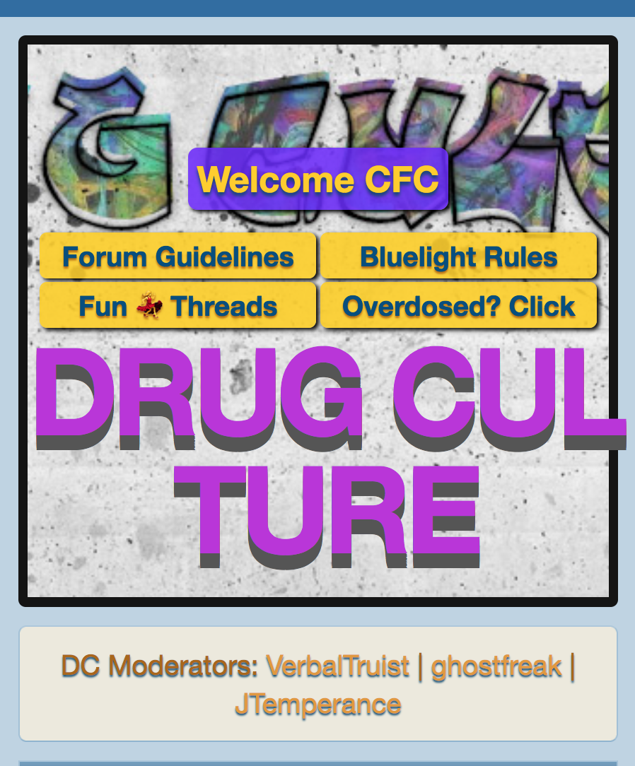
Code:
<br>inserted anywhere after the code for the "G" and before the code for the next letter "C" should fix it:
darvocet21
Bluelighter
- Joined
- May 31, 2021
- Messages
- 27,094
The graffiti looks cool in detail but maybe show a little morethe line break that used to sit between "DRUG" and