

TheLoveBandit
BL Emeritus
Greetings to all! In case you haven't heard, we're looking at updating our site software. Timetable puts us at end of DEC or early JAN. So, while staff are busy working to restructure the forums and exploring our server and software options, we thought we'd put this out to the most creative bunch on the site - are YOU interested?
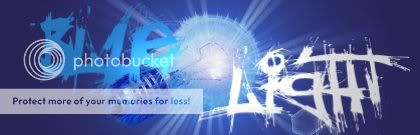
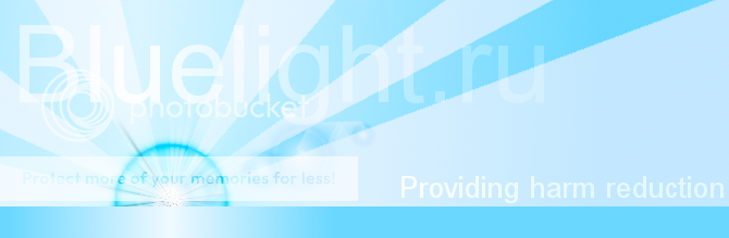
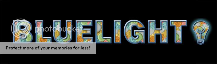
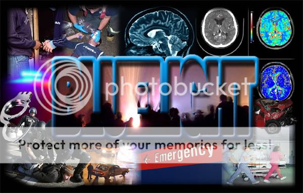
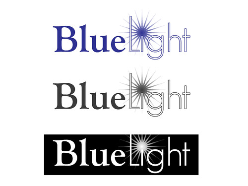
Current BL logo is at our top left of the page

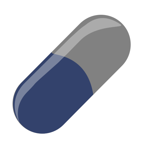
However, as we look to a new us, we should look for any new ideas for branding and logos. We are keeping the Bluelight name, of course, though the pill image can be dropped or swapped out with something else if you have new ideas. Additionally, we'd really like to work the words "Harm Reduction" into the imagery. Color scheme is yet to be determined, meaning the aria light blue we have on everything right now is not required - in fact if your image work can be flexible to color scheming that's a bonus, and two tone like we have not is not required (though it does help when we flip to blacklight). Things to think about and ponder as you speak with your muse to come up with some new things we could plaster on our site. Keep in mind, YOU will receive full credit, of course.
If you wish to see what's been done in the past, here are earlier attempts (broken links abound!), but the slate is clean for you to dream. Show us what ya got!
Reference:
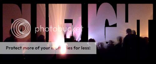
Redesign the BL logo (2007)
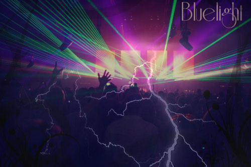
Redesign the Bluelight Logo II (2008 )
Also:
The Bluelight 2.0.08 splash page discussion - because if you have ideas for that, we'd love to hear them as well
Current BL logo is at our top left of the page
However, as we look to a new us, we should look for any new ideas for branding and logos. We are keeping the Bluelight name, of course, though the pill image can be dropped or swapped out with something else if you have new ideas. Additionally, we'd really like to work the words "Harm Reduction" into the imagery. Color scheme is yet to be determined, meaning the aria light blue we have on everything right now is not required - in fact if your image work can be flexible to color scheming that's a bonus, and two tone like we have not is not required (though it does help when we flip to blacklight). Things to think about and ponder as you speak with your muse to come up with some new things we could plaster on our site. Keep in mind, YOU will receive full credit, of course.
If you wish to see what's been done in the past, here are earlier attempts (broken links abound!), but the slate is clean for you to dream. Show us what ya got!
Reference:
Redesign the BL logo (2007)
Redesign the Bluelight Logo II (2008 )
Also:
The Bluelight 2.0.08 splash page discussion - because if you have ideas for that, we'd love to hear them as well


")
