• LAVA Moderator: Mysterier

Share your artwork v. BL's got talent

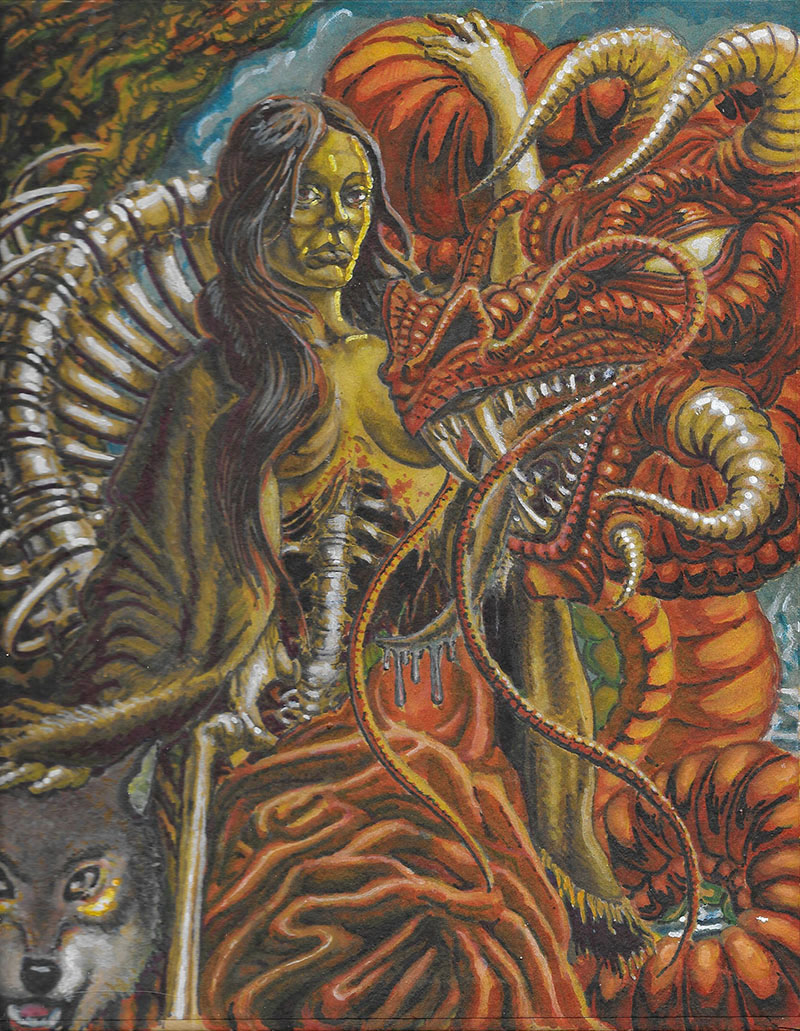
wow I just noticed the piece from neko-exceptional detail, the face seems to have masculine features (not that there is anything wrong with that), splendid use of color, lovely hair and dem are sum nice tits!

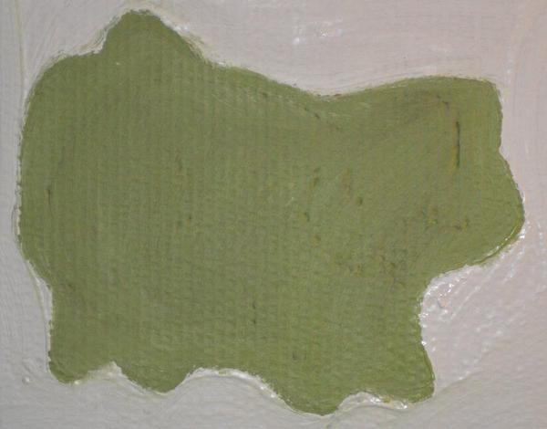
I think I have 3 cans of paint (black, white, green) maybe I'll try to come up with something...

great thread!
 
It'd be cool if there was a whole forum for visual artists, we got one for writing and music :/

... and we're actually in the midst of discussing how we can make SO more accommodating to visual art and how to have it here not just because this is a "catch all" forum. Changes are coming, I will say only that for now :)
 
^fuck yeah-if you need help in any way, let me know I got a lot of time on my hands :)

List the animals you see.


ev9hkg.jpg

I really do like this Laika.

from a sketch book destroyed by caltrans
72d06246776189.5607e3bb45509.jpg


here's some comic shit I did a while back that I think is funny.
74bed247015379.5607f24923b29.jpg


f83dd346782737.5607e7001f9c9.jpg


bec3f247015381.5607ef82d7465.jpg


here it comes....


9240d747015383.5607ef87a4445.jpg
 
I like that comic. You got multiple vanishing points and perspectives perfect. Im working on a 'crudzine' style comic myself. Its called Cockroach Boy World War IV. I'll post if i can ever make it presentable.
 
So, the magnificent art in this thread inspired me to create a painting of my own. I just finished my first piece, which I understand is not as impressive as the work others have posted however I am still quite proud of my accomplishment. There was even a point, a short duration, when I entered into the Zen Csikszentmihalyi 'flow state'. I think I would have been able to create something better if I had more materials available. All I had was two colors, an old worn out toothbrush, and a year old pizza box.

Anyway as soon as the paint dries I will take a photo and upload it here. sorry to keep you waiting.

Here it is, what do you guys think?
I5Me0D6.jpg
 
Last edited:
thujone said:
@Sigmond moss bear?

It started off as a picture of my cat not quite sure what it ended up as. One thing I noticed, if you move your head so it is horizontal with the left shoulder the painting will look entirely different. If you do not feel like moving your head you can always turn your comp 90° to the right.

after a lil gimpn'....

NSFW:
A79l5Co.png
 
Last edited:
I've been working on this piece for the last few days, saved it from disaster, theres a fine line between cool cross hatching and just over-doing it. It's also the first time I've worked with colored pencils in a while, but over all I'm pretty pleased with it, it's an illustration of the norse myth of Sigfried and the dragon Fafnir, who'm Sigfried cuts the heart out of and eats.

8e9b3834253249.56d2612ff2ed8.jpg
 
on the cool side of the line, I think, I do like the coloring/crosshatching
posing and the contrast to the background too
 
I'm putting this on my blog part two, but I need help with this, hit a dead end, having trouble pushing things into the background and front ground, atmospheric perspective is right in some areas and in other parts its fucked.
98977234253249.56e8535bb3d85.jpg
 
I'm not sure what you're asking. Are you looking for a way to make the figures in front look more like they are in the front and "pop-out?"
 
yes, exactly, atmospheric perspective, objects in the background should be hazier, obviously, foreground sharper contrast, but sometimes, knowing all this things still look wrong, why? I need a 'second opinion'
 
I can't really say. But it looks like the foreground us taking up 95% of the picture. Maybe increase the amount of background so the figure takes up no more than two thirds. Then the distance cues might work.
 
Or maybe the foreground is already the grand illustration of the picture. It could take all the space IMO there's not med gp background that is not evident in the picture already. Unless you want to work more with the 'wofl'.
It's a great picture. Congrats for your work!!
 
Or maybe the foreground is already the grand illustration of the picture considering the wolf and everything else.
It could take all the space IMO as the picture itself already shows the proportions.
From what I see the background proportions is more like what you'd like to frame or make it more like you want.
In my opinion this is already a great picture. Unless you want to work more with the 'wolf' but I don't think that's the case.
It's a great picture. Congrats for your work!!
 
I really do like this Laika.
And that really means a lot coming from someone of your caliber, thank you!


Here's a piece I drew by hand and then used a little bit of computer editing to make into more of a mandala and then I blew it up into a poster.. It was originally to be given away but that fell out for some reason and now it sits on the wall of my art studio..

12417571_10206153198243927_861714994155180482_n.jpg


I find it fun to look at.


Here's the original, which some say is cooler than the edited version:

NSFW:
shadows_dance_triumphantly_by_drawtheworldaway.jpg


Pretty sure I've posted that in the past, and maybe even the edit, just never a photo of it as a poster.
 
this is my mural, from my living room. it's derived from a bit in a mayan codex, but i changed it some. hummingbirds represent self-sacrifice, and for the maya, that meant blood. i changed the other figure to a vampire bat - one of the few truly (reciprocal) altruistic species in nature. thus it's about sacrifice and altruism, if you're a maya savvy ecologist. an art dealer said, 'i love how it shows the tension between the asian and african american communities'. it's titled 'there goes my rent deposit'.


uc
 
Top