

The states taking the opioid epidemic seriously (and not), in one map
German Lopez
Vox
February 22nd, 2018
Read the full story here.
German Lopez
Vox
February 22nd, 2018
There?s a simple way to understand how the opioid epidemic got so bad in America: In the US, it is much easier to get high than it is to get help for addiction.
How this applies at the state level, though, can differ ? some states have made an effort to build serious infrastructure around opioid addiction treatment, while others have not. This map, from the health research firm Avalere Health, shows how states are doing in providing a key frontline treatment for opioid addiction, compared to the amount of opioid overdose deaths they have:
NSFW: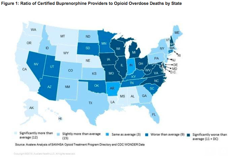
The map looks particularly at the number of buprenorphine providers in the state relative to how many opioid overdose deaths a state has. Buprenorphine is a medication used to treat opioid addiction; along with methadone and naltrexone, it?s widely considered the gold standard of care for opioid use disorder, with studies showing medications can cut the all-cause mortality rate among opioid addiction patients by half or more.
So if a state has less access to the drug and a high number of overdose deaths, it?s likely failing at fully addressing its opioid crisis. Based on the map, that appears to be true for states like West Virginia, Ohio, and New Hampshire, where opioid overdose deaths are very high yet access to buprenorphine is low.
A few caveats to the map: Some states, like Pennsylvania, have historically undercounted opioid overdose deaths ? so they may look better than they deserve in this kind of visualization. The map also doesn?t show the availability of methadone, another opioid addiction medication that some states, such as New York, may do better at providing than buprenorphine ? so those states may look worse than they deserve.
Read the full story here.


 atients.