Requests Bluelight drug icons project - community input wanted!

[Edited down by author to stay a bit more on-topic if possible.]

So this tread is supposed to be about community input for the drug icons. Apologies to everyone for digressing so much…
Side note: I wanna make a PocketDrugIcons app where it'll be an isometric view, maybe like a RPG and you get to pick and be one of the legends…


That's great. System of a Down have a tune called "Cocaine Makes Me Feel Like I'm On This Song" 🤣


Oh yeah that's the thing I keep my Cuban cigars in so they don't go stale, lol.


Yes, of course. By the end of WWI, no fewer than four European empires had fallen – the German Empire, the Ottoman Empire, the Russian Empire, and the Austrian Empire.


Hmmm, the Bluelightists mission statement is "Stay On Topic", I keep forgetting and straying way off…
My apologies for getting off topic, although I've thoroughly enjoyed this correspondence. I think you're funny, and I'm laughing at your answers to my posts.
I had some E put away for a special occasion and I had a friend from Atl visit me last week. So I decided to partake to see what it was like. After all it was sitting for over 6 months. I was concerned if it had lost his potency. I'm happy to report, it had NOT. It was certainly the best, and on a Tuesday night. That's always fun.
 
This has gone wildly off topic.
Yeah it has, sorry. I'll talk the fuckin' ears off a jackrabbit if you let me.

Make a relevant thread on another part of Bluelight please. CEP maybe? The Lounge?
Nah, no thanks, I edited a bunch of that shit down. Sorry bout dat!

Bring it back to the icons.
Are the icons intended to be animated? Maybe just with the CSS "on hover" property…

They look nice, but my honest feedback is that I don't care for the color palette, particularly I don't like the aquamarine (#21e9fb). It's too close to white and I think the lack of contrast could vex people with visual impairments. Maybe make the accent color sunkist orange?

I also think that each icon could be simplified, dropping some of the extraneous data and aim for more synecdoche. It looks bolder, more confident, not like you're trying to mask uncertainty with too many icons. Keep it stupid simple; just remember that simple = good, simplistic = bad. For example on all of them, lose the blue circle background. It's atrocious and makes everything look super old and dated… for reals, the color palette and blue circle background icon scream Facebook circa 2009, stylisically that is. I realize we're discussing the icon of a fuckin' pookie loaded with some rock'n'roll if ya know what I mean. Or 'shardonay' if you prefer, lol

I digress, where was I? Fuck it, I'm on one.
  • So for the bong icon, I would lose the bags of weed hovering by it. Simplify it to the basic shape of the bong, simplify the base of it.
  • Same with the Cannabis leaf – drop the bags of grass. It doesn't help convey shit and icons are pragmatism over idealism, form and function dovetailed.
  • For "glass pipe", just make it the pookie, nothing inside of it, no lighters and torch lighters and shit. Not necessary. A simple pookie illustration conveys everything, though if you insist, I could be persuaded to say that a crack stem, plain and simple, nothing else added, could accompany our aforementioned buddy, Mr. Pookie over there. Say hey to Pookie, everybody. "Hi, Pooks!"
  • The illicit pill illustration should maybe have three different shapes, bc that's how real pressed tablets from the streets look. Think: Teslas, Baby Yodas, Gameboys, and other fancy stamps and specialty cuts from cool dye kits.
  • LSD – just that single bicycle tablet. Who cares about other forms? Can't cover every RoA.
  • Fewer NO₂ canisters. We get it. You could consider a balloon in the icon on one of the tanks…
  • Naloxone – just the nasal applicator. Looks like a pack of Marlboros in the back of that one, lol.
  • Recovery – this one is really nice (minus the background & w/ a palette substitution.
 
Maybe we need our own mascot, like this one :)

295706342-1038890696994936-768700051047842435-n.jpg
 
Maybe we need our own mascot
Looks like Pacman's daughter. I realize Pacman was the OG raver, walking around in dark rooms listening to repetitive music, eating pills, and seeing apparitions, but maybe something more suited to a "blue light" like perhaps an anthropomorphic insect since bugs are drawn to lights? Or maybe a lightning bug who inexplicably glows blue?
 
Little Miss Harm Reduction is ace, thanks for that.

The feedback period on the icons past a few months ago but due to various backend reasons which will become clear soon, icons are not yet published, but we do have 20 of them, and they will be available for use soon.

We also have a list of drug related items that didn’t make it into the first 20 icons, so we can use that as a starting point if we want further ones down the track.
 
The feedback period on the icons past a few months ago
Whoops! … Yeah I thought my feedback was coming in a bit late, but everyone insisted we stay on topic as it started to veer, which I get, but is there nowhere to view just the icons themselves? They don't have to be in current use on the live site or even in staging, just an SVG file or whatever…

but due to various backend reasons which will become clear soon, icons are not yet published,
You don't know the backend reasons or they're yet to be announced is all? I can hardly fathom, what with this XenForo software no doubt patched multiple times to keep it up-to-date with browser updates since 2010 and trying to maintain cross-browser compatibility, responsive web design, and being mobile-friendly, etc. I imagine it's something of a nightmare at times.

but we do have 20 of them, and they will be available for use soon.
Kickass :rockon:

We also have a list of drug related items that didn’t make it into the first 20 icons, so we can use that as a starting point if we want further ones down the track.
Ok then. Seems like you wear a lot of hats around BLHQ. Do you have an Executive Creative Director or that's you? No judgments either way; I get that this is nonprofit. Just curious. 🙂
 
Good idea, I had no idea about that. I've been so fortunate all my life to never been in a situation where I needed to know what milligram someone or myself had taken. Looking back now, it seems kind of wreckless of me.
 
I know I'm late, but can we have a 130-140mg MDMA ecstasy pill icon, so people know the adequate dose of MDMA to get you up.
Well so technically it depends on the user's body weight. A proper dose is really 1.5 - 2 mg per kg bodyweight. Some people actually advocate less. So for example, a person who weighs 77 kg (read: 12.5 stone || 175 lbs.) should take a dose of 115 mg - 154 mg. A person weighing, say, 57 kg (~9 stone or ~130 lbs.) would take 85 mg to 114 mg.

Keep in mind: this is the suggested range for therapeutic purposes. Most people I know take MDMA recreationally, myself included. I like to roll hard when I roll. I weigh ~175 lbs, but I typically take 180 mg first and then a 70 mg booster after two hours. Then I stop and change to other drugs if I want to keep partying. LSD is a common choice and so is ketamine and/or 3-HO-PCP, but if I need to keep my wits about me, I'll opt to vaporize a little bit of meth instead, which I greatly prefer to cocaine. Coke makes me jittery and anxious. I keep my meth dosing low and never IV it, and it's just a smooth stimulation ride that enhances sex far more than coke ever has for me. Lasts longer, and it's cheaper. Meth really gets a bum rap bc of the compulsive types out there who abuse it and give it a bad name.

But I digress. I say adding the mg labels is both not realistic and inaccurate. I acknowledge the intention is noble but I think it's trying to pack too much specific information into the icon/symbol. Just my two cents anyway.
 
Hello everyone!

EDIT 21 June 2023: We have prototypes of the 20 icons. We would love your input. At this stage please comment on how they can be improved, especially whether or not they don't match up with what's actually happening. Input by June 30 would be great! Here's the link you can comment on.

EDIT 4th May 2023: So, we are at the point of having the final 20 ideas with some left over for round 2 later (so if you come up with more ideas, please add to the comments and we will incorporate into next round). First off, I will be advising designers of the actual types of images we want to have depicted in the first instance. Once that process is complete, I'll offer prototypes to you all to check out and critique, so we can make them look as excellent as we can, as well as have them accurately depicting each thing based from your first-hand experiences. So, stay tuned everyone and thanks again. :)

ORIGINAL TEXT BELOW
As part of our rebranding project, we are going to create a set of drug-related icons. We would then use these in our branding across the site and our other communities, alongside a new logo.
The logo will represent dialogue whereas the multiple icons will represent the many varied drug topics that we discuss.
While the logo will no longer contain the capsule, rest assured that one of the drug icons will be a capsule - the capsule will live on! But this way, the wide diversity of drug types and topics will be displayed - to show the diversity and variety of Bluelight's scope.

We'd love to get all our community's input into this process.
First we need to decide on 20 different icons - and what they will depict. (Note, I reckon we will have more than 20 good ideas, and we can save those that don't make the first 20 for another round of icons, perhaps in 2024).
Once we've decided on the 20 icons we want to create, our branding agency will create a set of prototypes and provide them back to us for comment.
We can then comment on how to improve them, and then settle on the final set of icons.

Then, the plan is to make the icon set available via creative commons licence for anyone to use, with attribute to Bluelight.org. We hope this will be a neat way of spreading the word about Bluelight to anyone who creates digital content related to drugs that might benefit from using the icons for their own projects, and their audiences.

So, how can you help?

Here's a basic list with some definites as well as some holes we will need to fill.
Broadly I have imagined we would have icons covering drug forms, drug routes of admin, harm reduction and recovery. But this is just an idea, open to critique. we could also change the ratio between the four categories of course. I also haven't covered any legal drugs, e.g. alcohol, caffeine, cigarettes in this set... might not be space for these? but open to ideas on that too if folks think they should be included.
Please comment below with your ideas and I'll update the list and hopefully we will then get to a final 20 concepts before going to create the icons!

1. [form] Capsule (generic)
2. [form] Illicit tablet (e.g. 'ecstasy' pill)
3. [form] Ziplock bag of powder (generic, could be cocaine, heroin, speed, etc)
4. [form] Cannabis leaf
5. [form] LSD blotter
6. [form] Pharma pills (e.g. looks like generic medicine, rather than illicit tablet - something like a xanax bar?)
extra icon ideas - other pharm pills - for round 2)
7. [form] nitrous cannisters
8. [form] mushrooms
9. [route of admin] syringe and injecting equipment
10. [roa] snorting lines of powder
11. [roa] glass pipe e.g. for meth/crack
12. [roa] bong / water pipe
13. [roa] vape
Additional ideas for next time - [roa] plugging (note, extra roas - edible & sublingual)
14. [hr technique] reagent test kit
15. [hr technique] wheel filter
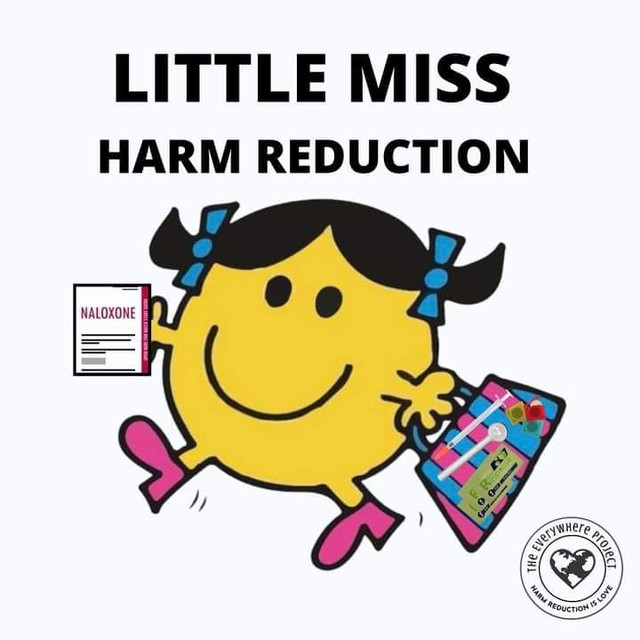
16. [hr technique] naloxone
17. [hr technique] scales
18. [recovery related] support - two people embracing
19. [recovery related] a person waking up to a sunrise
20. [recovery related] sobriety chip

Please do be critical. We want these to represent things people actually do in 2023. Some of these might not be relevant to you or your networks - if so it would be good to get that critique and perhaps information about alternatives we can depict that do resonate with your experiences. It's fine if we end up with a list of 30-40, as we can use the leftover ideas for round 2 :)

Note: the image chosen here is a selection of drug icons made by Alpár-Etele Méder (https://www.iconfinder.com/search?designer=pocike&q=drug) available through a creative commons license.

Edit July 2023 - Round 2 ideas are placed below for when we do a second round of icon codesign:
- routes of admin - plugging (anal administration)
- routes of admin - edibles and sublinguals
- drug type - cactus / mescaline
- drug type - alcohol / drinking (e.g. beer bottle + wine glass)
- drug type - GHB (including syringe without injecting tip for safer dosing)
- drug type - steroids and other imaging enhancing drugs
- routes of admin - steroid injecting equipment
- police or law book representing 'the law'
- chemsex icon, e.g. could include GHB fishy, pipe (meth), bottle amyl and a condom
- a glbtiq+ icon possibly?
- drug type - DMT
- route of admin - dab rig for cannabis concentrates
This is an exciting news on the progress of the rebranding project. It's awesome that you're involving the community in shaping the new drug-related icons. I think, Delta 8 gummies is a good product to be considered as well. I look forward to seeing the prototype and contributing further to this creative process.
 
Top