• LAVA Moderator: Mysterier

Requests Need help with BL Logo

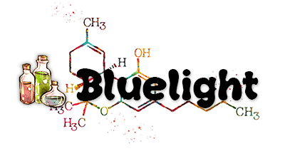
bluelight3.png


(could replace the bottles with a pill of course)
 
bluelight3.png


(could replace the bottles with a pill of course)
Damn you work quick. This is Photoshop right? My idea was to take the new pill logo as posted above and add a chemical diagram like that behind the pill. Maybe a smaller chemical. I might have to dust off the old Adobe skills myself kinda miss it. Make the diagram greyscale as to not detract.
 
Could somebody send me the new pill logo as a PSD or something easy to import?

Yeah, it's photoshop, guess with GIMP you can do similar things but unfortunately the unix folks are notoriously bad with UI/UX. That's my thing that I like tech and design, and am somewhat good in spotting problems, but never managed to turn it into anything real like a job :( fuck war on drugs. Microsoft, RedHat etc they would really need somebody like me xD
 
I'm assuming he made it in illustrator, if you have illustrator installed you can trace it and export to psd, but that may cause some pixelation. Maybe wait for him?
 
To make a pill logo?

Pfft too easy look
Embq3e2.png

Rofl. I love it. <3

I never actually realized until now (probably cause I never really thought about it)...

The bluelight pill specifically looks like a 30mg Cymbalta pill. Blue and white capsule.
 
Last edited:
Any news? I just like to take this sort of challenge, no hard feelings if somebody else win but I raise the bar 🙃
 
@dopamimetic

pretty good!

I would make it the bluelight forum colors (blue), maybe slightly darker.

maybe move the diagriam slightly up and to the left (slightly) and remove the dots/noise/splotches whatever those are.

also lighten the diagram even more, to the point where it's not that visible.

I'm just suggesting what I would do if I had adobe open.

also best to keep it vector, then we could use it on stickers/flyers/papers/etc whatever in the future (unless you are working at an extremely high resolution)

gj though
 
Nice work Cal! :)

My personal faves are 5 and 1, but actually I wonder if a slightly elongated (but equally thick) 6 would also look good?

I very much like the graphic boldness and consistency of using a thick line for the pill, I just felt it was a smidge too compact in the original.
Thanks!

I agree, I think the boldness and thick line for the pill is quite attractive, and makes the logo stand out more as a contemporary logo and brand. I'll do another set of design iterations to add that in — I think we are getting close to something that works.

Also, let me know if you have any other ideas you'd like to add in. There's always the option to add more elements to the logo mark (as other community members have suggested—such as dopamimetic—all of which are great ideas. But, it comes down to what Bluelight's vision for their brand is and what they want to stand for)

-Cal
 
  • Heart
Reactions: CFC
Update:

I thought dopamimetic's molecule logos were cool and had a strong brand presence, here's my take of incorporating some designs inspired by theirs

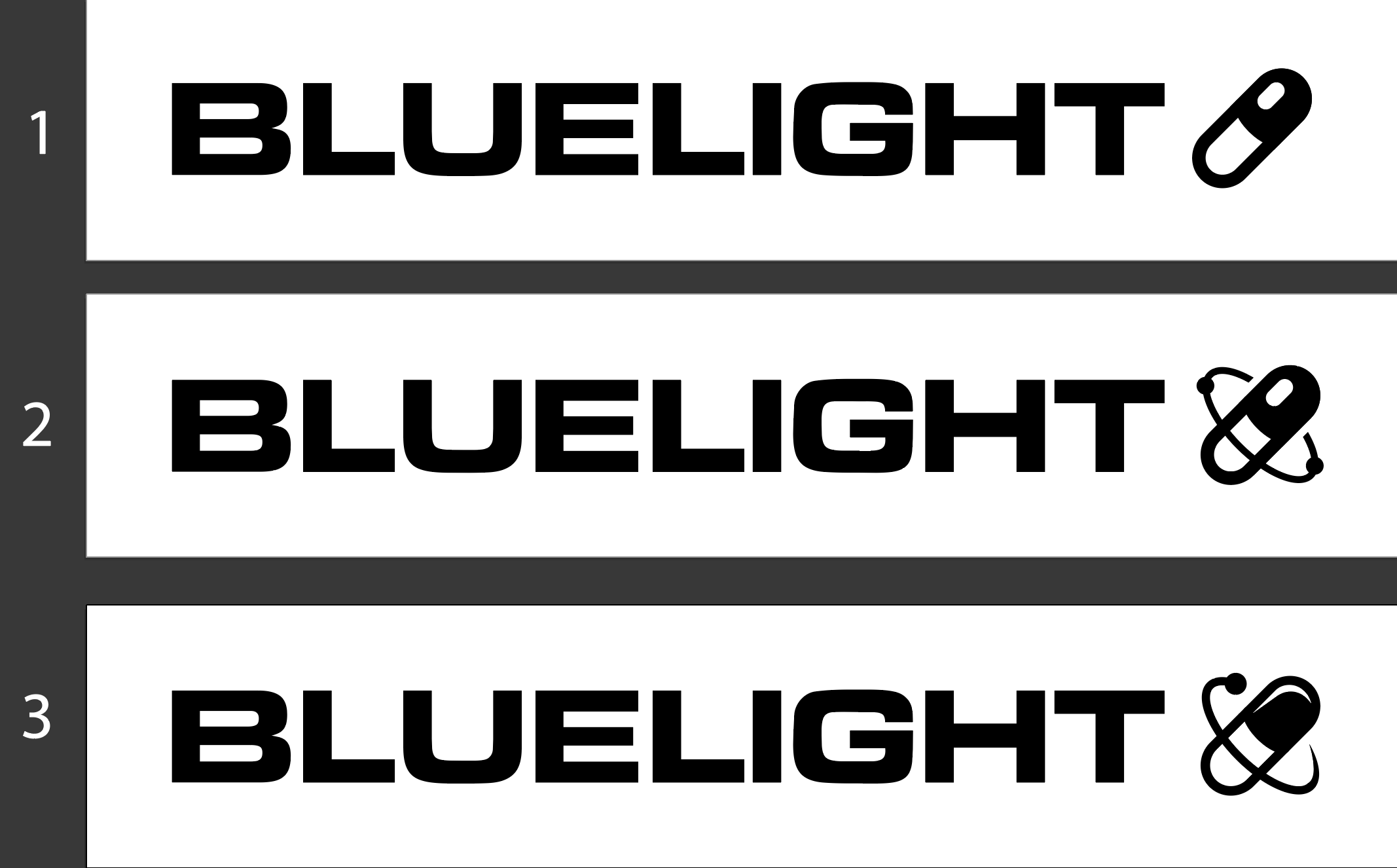
  1. The elongated thick pill per CFC's suggestion (with a curved center center line similar to current logo)
  2. Elongated pill with particles orbiting around it
  3. Elongated pill with slightly different reflection & 1 particle orbiting it

r8bGzLk.png


Thoughts?
 
Last edited:
^ I love how you incorporated that into #2, specifically. Brilliant.
 
^ At first I thought #3 was the best, it just had that "it" factor with the half electron cloud. But, I think #2 is better representative of an accurate electron cloud around the pill, representing an atom, just like Bluelight is for accurate information for drugs (science, chemistry, etc.). I would say it just works better with what this site represents, unbiased and accurate data. That's what went through my mind, anyways.
 
@immakingthelogo

#3 is sexy af, excellent reflection on the dark side of the pill

You make me want to install illustrator again! I used to be a freelance logo designer... too bad I'm color blind and working with people on colors was a fucking nightmare
 
Update:

I thought dopamimetic's molecule logos were cool and had a strong brand presence, here's my take of incorporating some designs inspired by theirs

  1. The elongated thick pill per CFC's suggestion (with a curved center center line similar to current logo)
  2. Elongated pill with particles orbiting around it
  3. Elongated pill with slightly different reflection & 1 particle orbiting it

r8bGzLk.png


Thoughts?

Personally, I prefer the dark half of the pill (it's weight/shadow) at the bottom (as in the present logo), and since you've simplified things I think the non-skeuomorphic straight line makes more design sense.
 
Deru- Agreed! Both have their place, it comes down to what the objective of the logo should be (readability vs accuracy regarding the topic). I slightly adapted #2 into #3C in these next set of designs

SnafuInTheVoid- Nice! That must have been frustrating trying to get the colors right, I'm honestly impressed you were doing design colorblind! I work so hard to make sure my colors are right and still doubt myself sometimes

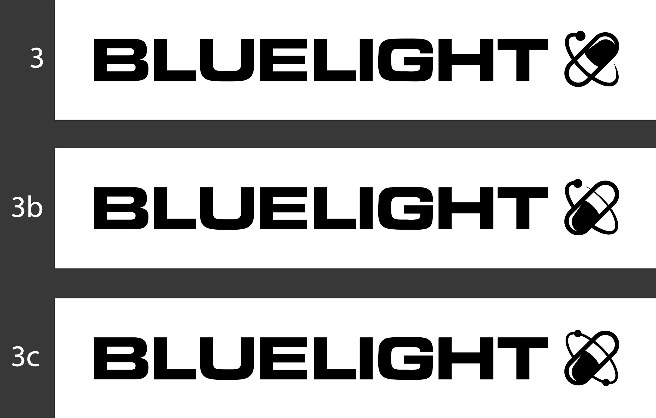
CFC- Got it, I noticed that the dark half was on the bottom side, but I wasn't sure if it was preferred to follow it exactly. I expanded #3 and created #3B and #3C.
  • Because the black half is on the bottom side, I've switched the overlapping part of the orbit path to the top side now
  • 3b is 3 but "flipped"
  • 3c has a thinner orbit path, and an additional "electron" in the orbit

TEqCFgT.png
 
@immakingthelogo

Client: I want it to be purple
Me: Ok, here you go!
Client: That's not purple...
Me: How about this?
Client: That's not purple either
Me: *pulls hair out*
Client: Disputes payment

I just gave up after a year or so. I wasn't even charging that much, flat rates about $100. Wasn't worth the stress.

I have deuteranopia. Mainly red/greens but also the secondary colors with those... so basically 70% of the colors... I remember being about 10 years old when I figured out something was wrong. I was at a football game and then after a whole hour suddenly the words "BEAR DOWN" in huge red letters covering literally half the sideline of the field popped out magically like it materialized out of thin air. I couldn't see it the whole game... it was green like the grass. I thought I was hallucinating or something. Also all those circular color tests with all the dots... I fail 100% of those. And somehow NOBODY told me I had colorblindness.... I figured it out on my own when I was about 18.

I can thank my mother for my gene. Thanks mom.
 
Would it be a consideration to add some slight color or art in the background around/behind the logo, you're right I guess about branding and it's just me but since I began spending more time around here, I began to miss something somehow. The design looks so overly technical.

Like the mobile version though.
 
I'm not a designer, or an artist but a ui ux (front end web developer), but have skills and tools to create vector versions in all colours suitable for print etc if I have a design to follow. I used to teach Photoshop and illustrator at uni, and also worked commercially for tons of brands. I know how to create the right versions, branding and guidelines, style guides marketing, strategy etc. Where are you at with this
 
I'd work in black and white first, then add brand colours. Do you have any branding guidelines? Maybe that's somewhere to start working if it's up your road map.
 
Top