Site Feedback Dark Mode Constrast Issues

finitelifeform

Bluelighter
Joined
Dec 26, 2020
Messages
343
Hi guys, just letting you know the dark theme fails the WCAG standards.
I have no (that I know of) issues with my vision and I'm straining somewhat to make out certain parts of the site, particularly the textarea element when writing replies/posting etc. Also you cannot see the cursor when you're moving around in the textarea element to move to different areas of the text you're writing. I'm sure some simply JS will invert the cursor, probably might be able to throw in some CSS. On focus/hover pseudo-class for the textarea element as well as rules for the font colour etc reflects the poor design implementations from what I can see.

You've got two colours set (in hex):

Post area background - #93A5A5
Text in post area - #606060

They fail ALL criteria for WCAG standards. I was just thinking about members of the site who have issues with their vision and perhaps are struggling while this theme is active.

An example of contrasting testing:

Keep up the good work, thanks for being around.

EDIT: The contrast is not so bad viewing from the thread, it seems to be in the editor only, at least that's where I've had the most issues.

 
I'm pretty sure the issue is limited to the text-editing box. XenForo developers decided to break their own style rules when they updated the design of the text-editing box during the last major upgrade late last year. It'll require admin to fiddle around with the style template coloring a bit to fix things. Have you tried using a different viewing style until that's done?
 
I'm pretty sure the issue is limited to the text-editing box. XenForo developers decided to break their own style rules when they updated the design of the text-editing box during the last major upgrade late last year. It'll require admin to fiddle around with the style template coloring a bit to fix things. Have you tried using a different viewing style until that's done?
It does seem to be just the text box. I'm not sure if there are other areas of the theme template that are affected by the low ratio contrast.
I'll change the theme from my profile.
 
You've got two colours set (in hex):

Post area background - #93A5A5
Text in post area - #606060

They fail ALL criteria for WCAG standards.


Aye, we noted it at the time but didn't spend the additional time required to resolve it since blacklight style was used sparingly. It should be addressed, but thus far hasn't been and likely won't until someone has time and interest to dig into it.

I have no idea what WCAG standards are. I will only state how fortunate you are to have missed some of our earlier style experiments as they would also fail any standard of decency. Maybe we can bring one of those back for comparison <3

In seriousness, switch it up to something better for your needs until we can (someday) get to it. Sorry, I can't offer more than that.
 
Shit. This just switched back. I'm out. I liked it black :(
 
Shit. This just switched back. I'm out. I liked it black :(

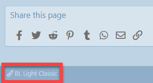
Blacklight remains an option. Go to the bottom left of the screen and you'll see a ghosted "BL Light Classic". Click on that and you have several styles to choose from.


H3PCQBD.png


CSSzNhH.png
 
Aye, we noted it at the time but didn't spend the additional time required to resolve it since blacklight style was used sparingly. It should be addressed, but thus far hasn't been and likely won't until someone has time and interest to dig into it.

I have no idea what WCAG standards are. I will only state how fortunate you are to have missed some of our earlier style experiments as they would also fail any standard of decency. Maybe we can bring one of those back for comparison <3

In seriousness, switch it up to something better for your needs until we can (someday) get to it. Sorry, I can't offer more than that.
It's cool. The WCAG are standards setup by W3C, the guys who are create standards by which the web functions. WCAG is effectively standards that ensure the web is accessible to everyone, mainly people with disabilities. I was just worried that perhaps some people were having difficulty accessing the board when the theme was active. Maybe I put my foot in it by mentioning it and should now have the most indecent style applied to my account via an admin to pay the price for my obscenity :p

EDIT: I like the dark theme, do my coding all in dark
 
Not to mention staff and ownership.. We have failed ourselves.. wait we are not to blame.................. its the platform. Wipes clammy unjust sweat from brow. Straitens bow tie. and swaggers confidently on down the road to a pub.
 
It would be good if we could get the blacklight theme to be more accessible, but it is worth keeping in mind that it can be overridden and only lasts for 1 week.

Do we specify to people how to change the theme back if they have problems when we link them to the blacklight explanation post? If not that might be a good alternative until there's time to improve the theme. So at least anyone negatively impacted can choose to switch back early.

Dunno just a thought.
 
Top