• LAVA Moderator: Mysterier

Art Post some ART that you're feeling today - and why?

Virginia+at+9+by+Sally+Mann.jpg

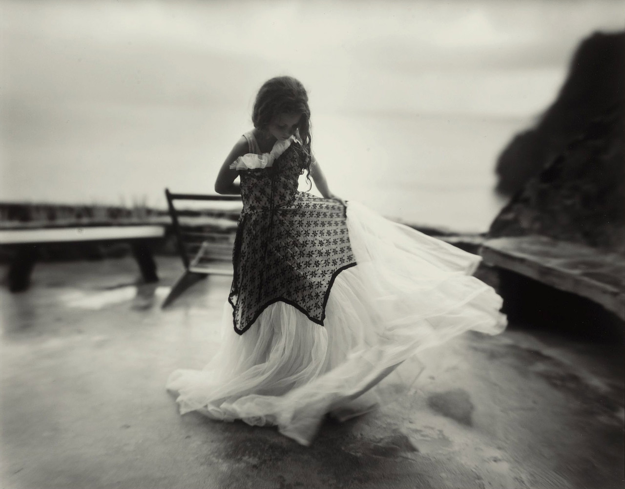
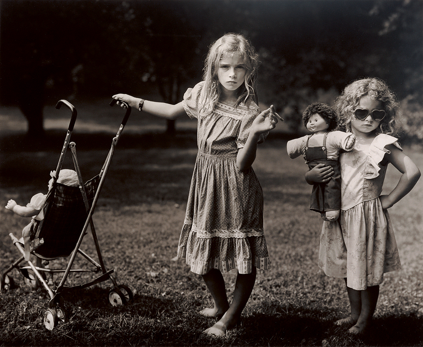
Virginia at 9, sally mann

mann's the best. they really need to release another photo book of her Immediate Family-esque photos. she had an exhibit or collection called Family Portraits--where's the accompanying book?

oh, and i am feeling the above piece of art because it is ethereal, bluelight appropriate, and more difficult to find than the photos included in Immediate Family. i love the way the focus and fore-, middle, & background compliment the subject's slight twirling motion. the dress is perfect for the photo--like the focus, it is wonderful combination of sharp and soft--and virginia seems all about it.
 
Last edited:
Didn't know about Sally Mann, thanks for the heads up!

Work is making me feel like this, minus the fun:

DanWitz_BigMoshPit-2007.jpg


Dan Witz - Big Moshpit
 
8qrFx33.jpg


A modern image taken at Omaha beach overlaid with a shot taken there on June 6 1944.
 
Didn't know about Sally Mann, thanks for the heads up!
have you checked out any of her other work since? if so, what do you think?

today i am feeling The New Mothers by mann, 1983. because jessie's dress is pretty, both the sisters have awesome poses, and it is just an all around fantastic photograph. though i am extremely hesitant to post any of the copies i am able to find online. the copy in aperture's publication of Immediate Family is far superior. not everyone has that book, so...

thenewmothersmisstintsallymann.jpg


this copy of the photo is much brighter than aperture's printing. also, the light spots on the top and right edge of the photo are blemishes not present on the actual film.

another reasonable copy i was able to find...
NSFW:
sallymannthenewmothersscreenshot.jpg

this is a screenshot someone took in what i imagine to be a flash player preview. so the selection box can been seen and it is cropped different than the aperture copy.

neither are the same tint as aperture's printing. better than nothing. i spent quite a bit of time determining that these were the best that could be found.


NSFW:
tumblr_mc3jleyLYe1qz6f9yo1_500.jpg


By Victo Ngai
very pleasant!
 
Last edited:
NSFW:

Art by my 5th and 6th graders (collaborative collage):


These are so lush! :D

have you checked out any of her other work since? if so, what do you think?

today i am feeling The New Mothers by mann, 1983. because jessie's dress is pretty, both the sisters have awesome poses, and it is just an all around fantastic photograph. though i am extremely hesitant to post any of the copies i am able to find online. the copy in aperture's publication of Immediate Family is far superior. not everyone has that book, so...

thenewmothersmisstintsallymann.jpg

Remember you posting alot by her previously Hydro. Her work is pretty striking! That Cabbage Patch doll has done far too many steroids for its own good.

Was looking over an old art book the other night and these two stood out for me. Would write more but this comp is being a bitch!

Thomas_Gainsborough_-_The_Artist%27s_Daughters_with_a_Cat_-_WGA8404.jpg

Gainsborough| Painter's Daughters

the-two-sisters-theodore-chasseriau.jpg

Chassériau| Two Sisters
 
Last edited:
i think i get it ... she was a dog the whole time.


sallymanndeepsouth17.jpg

#17, 1998 Deep South by sally mann

her use of whatever old-y process to capture and develop allows for such beautiful, organic manipulation.

wonder what she's working on these days. ondria in rodarte couture '14 by sally mann.
 
Q3JjgG7.png


I get the same effect looking at a candle in meditation. Time dilates.
 
R-4770939-1374994939-1852.jpeg


I'm done with my shameless self-promotional post for the day.
 
Last edited by a moderator:
hope those are passes, not tickets.


Gordon+Parks.jpg

by gordon parks. not sure what this photo is titled.

because it feels surreal. when taught about the the flaws behind "separate but equal" as a kid i always thought of the biggest flaw as being that the equal part wasn't maintained in the literal aspect. and i figure that was the most practical flaw. in this particular instance that doesn't exist. the "colored only" fountain actually looks a bit newer and nicer. creepy because resources were used in to successfully implement this absurd idea. doesn't feel like a piece of recent human history. instead some alternate society in a science fiction b-movie. highlights what is really horrid about the concept.

also because of their composure in beyond beautiful dresses. and mid-20th century branding is slick.
 
My conference is over. I like one piece more than the other.

[video=vimeo;72551133]http://vimeo.com/72551133#[/video]
 
that's awesome, Kenickie! there's a nonprofit wrapping up a similar project downtown in a city that's not quite hip like atlanta. wandering around on lunch, i always wanna get a photo of them and the scaffolding and all that. i wouldn't do anything more than tweet it and it's one nonprofit to another, so i don't care about getting anything signed. but it's a bunch college kid looking painters. i'm afraid that they either won't know if it's alright for me to promote the photo and i'll just be interrupting. or they will say yes and then the next day i'll get a call from one of their directors asking me whatthefuck i think i'm doing. anyway, it's a big-budget nonprofit and the pieces are huge, but the art is not nearly as cool as in your video. much more conservative. doves and stuff like that--we have to concentrate really hard on not shooting each other. the pieces in the above video have a much more raw, open feel. again, awesome.


+kate+moss+Glen+Luchford+-+Damaged+Negatives.jpg


from the collection Damaged Negatives by glen luchford

AnOther Magazine said:
“I put the images in storage for two weeks,” Luchford explains, “which turned into two months. The entire storage unit flooded and the owner didn’t tell anyone, so by the time I arrived, the images were just mostly gone or in a state of high deterioration. There were flies and mould everywhere. On a sub-conscious level, you have to ask why I would ever have put them in such a ridiculous place,” he continues, “considering one print just sold for £25,000, and I lost thousands and thousands of negatives.”
an attempt to preserve fading beauty -- sorry kate, you are mortal -- deteriorates. in this instance, new beauty is created. with time, that will be lost as well. drives me wild.


this consecutiveness has got me a little nervous. red rover, red rover...
 
Last edited:
Top